Creddle Templates 2026: How to Recreate the Classic Creddle Resume Style
Creddle shut down in December 2024, and with it went the templates that thousands of us used to land jobs. If you're searching for "Creddle templates" hoping to find your old look, I get it. I used Creddle for years. This is a guide to recreating those styles, and going further than Creddle ever could.
Creddle wasn't just 100 templates in a dropdown. It was a design system. You picked a starting point, then adjusted fonts, colors, spacing, and layout until it looked right. Most resume builders give you a template and expect you to fill in the blanks. Creddle gave you tools.
The templates people loved were really just combinations of specific settings. Here are the four most common Creddle looks, recreated in Text2Resume. I made each of these by telling Rezzy (our AI agent) what I wanted. You can copy the same prompts or just use the specs below.
The Clean Minimalist
This was Creddle's most popular look. Single column, centered header, lots of white space. The kind of resume that says "I know what I'm doing" without trying too hard.
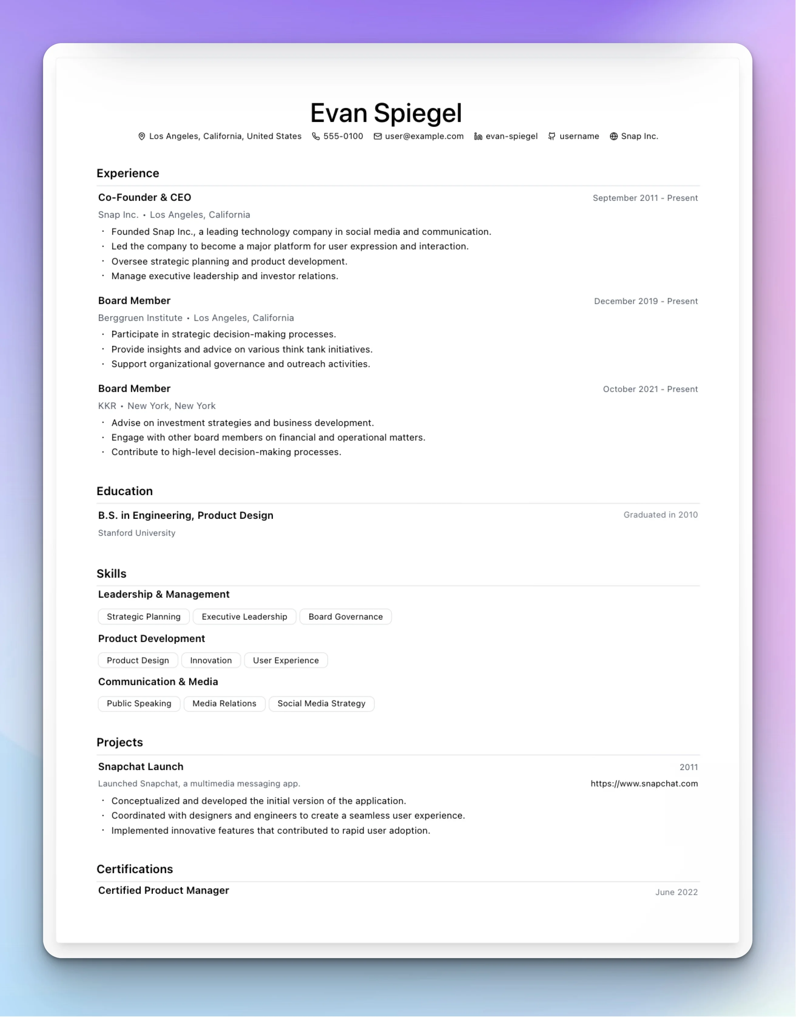
| Setting | Value |
|---|---|
| Font | Geist or Barlow |
| Layout | Single column |
| Header | Center aligned |
| Background | None |
| Colors | Black text, gray (#6b7280) for dates |
| Section spacing | 24px between sections |
| Dividers | 1px lines, light gray |
In Text2Resume, start with the "Build with AI" template. It's already close to this look. Or just tell Rezzy: "Switch to Geist font, center align the header, add 24px between sections, and add thin gray dividers."
The Two-Column Sidebar
Left sidebar for skills and contact, main column for experience. The left half often had a subtle background color. This was the "modern tech" look.
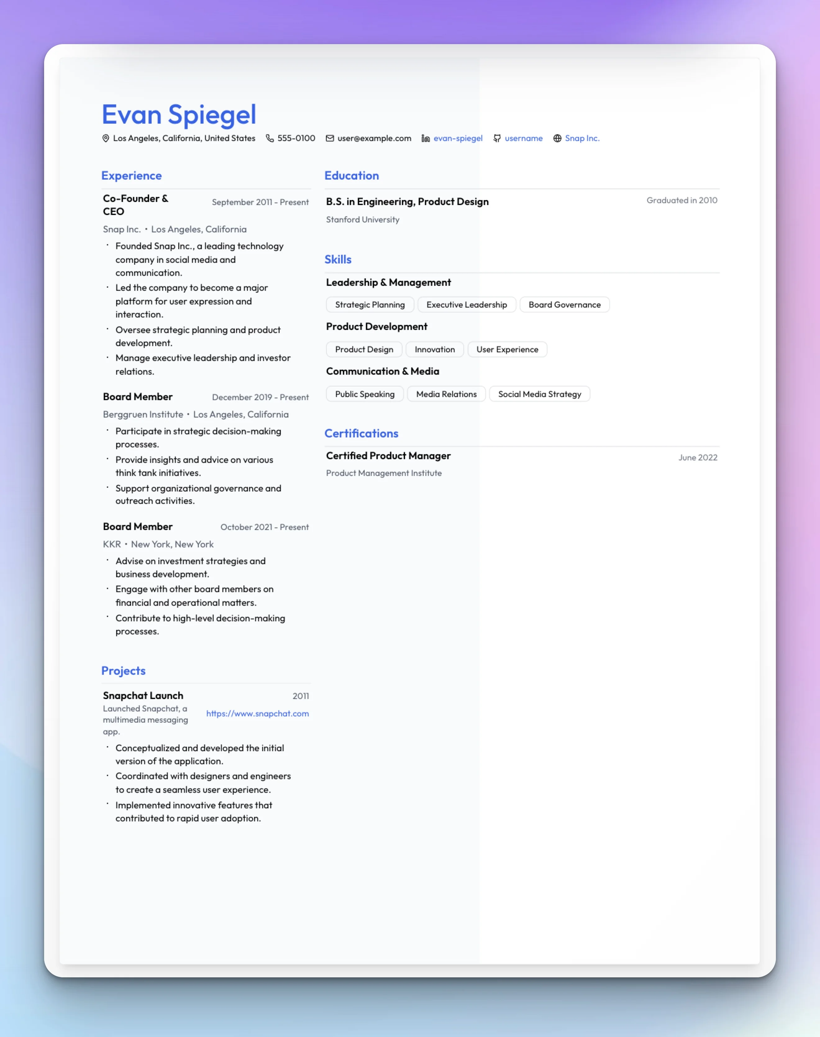
| Setting | Value |
|---|---|
| Font | Outfit or Instrument Sans |
| Layout | Two-column, 35% left |
| Header | Left aligned |
| Background | Left half, light gray (#f8fafc) |
| Accent color | Blue (#2563eb) for name and section titles |
| Contact labels | Icons, single line |
| Skills display | Badges |
Start with "Modern Professional" and adjust column width to taste. Or tell Rezzy: "Two-column layout with 35% left sidebar, add a light gray background to the left side, use blue for my name and section titles, show skills as badges."
The Traditional Business
Times New Roman. Center header. Conservative spacing. The resume that says "I've been doing this for 20 years and I'm not going to apologize for using a serif font."
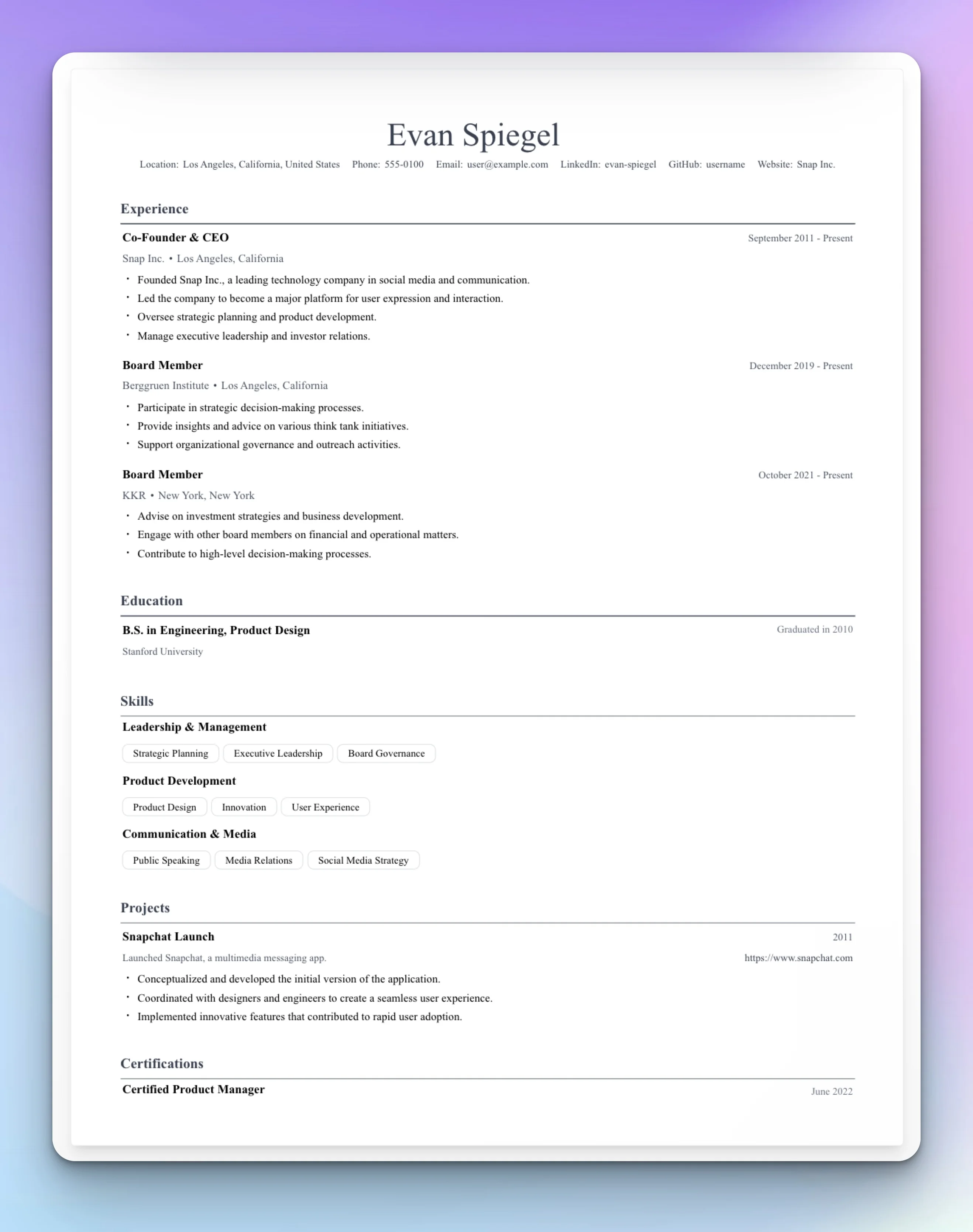
| Setting | Value |
|---|---|
| Font | Times New Roman or Termes |
| Layout | Single column |
| Header | Center aligned |
| Background | None |
| Colors | Dark gray (#374151) for everything |
| Contact labels | Text ("Email:", "Phone:") |
| Dividers | 1px, solid |
Tell Rezzy: "Use Times New Roman, center the header, dark gray for all text, add text labels to contact info like Email: and Phone:, and add solid 1px dividers between sections."
The Academic
Computer Modern font (the LaTeX default), generous margins, formal structure. For researchers, professors, and anyone who thinks PDFs should look like published papers.
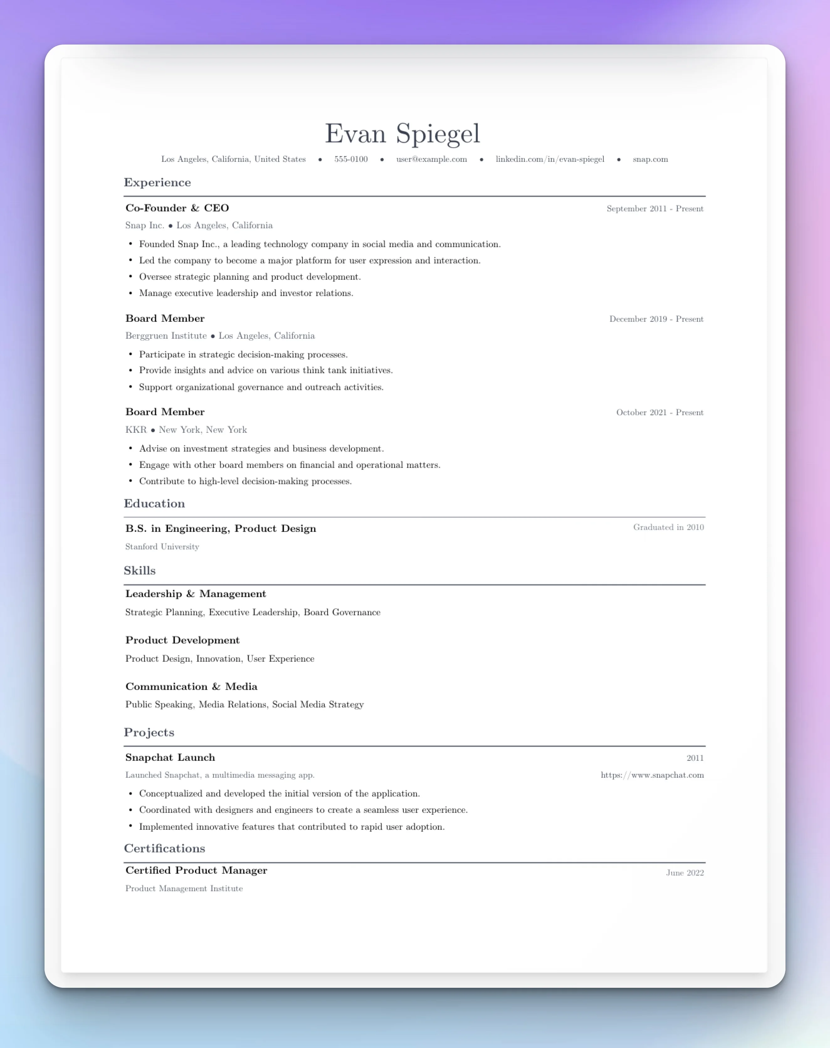
| Setting | Value |
|---|---|
| Font | Computer Modern |
| Layout | Single column |
| Header | Left aligned |
| Margins | 0.75" all sides |
| Contact fields | Include Google Scholar |
| Section spacing | 16px |
The "Academic Scholar" template is built for this. Or tell Rezzy: "Use Computer Modern font, left align the header, set margins to 0.75 inches on all sides, show Google Scholar in contact info."
How It Works: 200+ Layout Controls
Those templates above are just combinations of settings. Text2Resume's style panel has three tabs: Typography, Colors, and Layout. Here's what you can control.
Typography: 21 fonts across five categories (sans-serif, serif, monospace, display, script). Independent size and weight controls for seven text elements: name (18-48px), section titles (12-24px), headings (10-20px), subheadings (8-18px), body (8-16px), contact (8-16px), and dates (8-16px).
Colors: Five text color properties (name, section titles, contact, accents, dividers). Five background fill options: none, full page, left half, right half, or header only.
Layout: Single or two-column with adjustable width (30-70%). Header alignment (left, center, right). Twelve spacing controls for section gaps, bullet spacing, margins, and more. Divider thickness and color.
Details: Five bullet styles (circle, square, dash, triangle, chevron). Contact layout (single or two lines, icons or text labels, separators). Skills display (badges or comma-separated).
You can use the sliders directly, or just tell Rezzy what you want.
Skip the Sliders
Creddle made you hunt through menus. Text2Resume lets you just say what you want.
Type "make the font bigger" and the font gets bigger. Type "switch to two columns with a blue sidebar" and it happens. The AI translates plain English into the right combination of changes.
Example commands:
- "Center the header and make my name bigger"
- "Use a serif font, something traditional"
- "Add more space between sections"
- "Tighten everything up, I need to fit on one page"
- "Add a subtle gray background to the left column"
"Make it more conservative" means serif fonts and muted colors. "Make it more modern" means sans-serif and tighter spacing. You don't have to know which slider to move.
What About Auto-Fit?
Creddle's automatic one-page fitting was its signature feature. As you added content, it would shrink fonts and tighten spacing to keep everything on one page.
Text2Resume takes a different approach. Instead of automatic scaling that can leave you with 8pt body text, you get precise control over every spacing value. The real-time preview shows exactly how your content fits. If you're running long, you know exactly which slider to adjust. Or you can just tell the AI "tighten this up to fit on one page" and it will find the right balance.
The result is the same (one page) but you stay in control of the proportions. Your name doesn't suddenly become tiny because you added another bullet point.
Getting Started
If you're coming from Creddle, here's the fastest path:
Import your content. Upload a PDF of your old resume or paste your text. The AI structures it automatically.
Pick a starting template. "Build with AI" for minimal, "Modern Professional" for two-column, "Traditional Business" for conservative, "Academic Scholar" for research.
Adjust with the style panel or just tell the AI what you want. The controls are there if you want them. The AI is there if you don't.
Export as PDF when you're done.
Creddle proved that job seekers want real control over their resume's appearance. Text2Resume carries that forward with more controls, better organization, and AI that understands what you're trying to do.
Recreate Your Creddle Style
200+ layout controls. 21 fonts. AI that understands "make it look more professional."